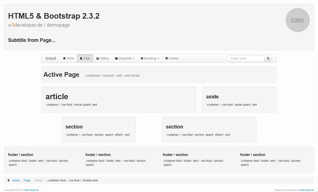
article
.container / .row-fluid / article span8 .well
Download bei Bootstrap 2.3.2 | html5shiv.js | response.min.js
Die your-template Dateien erstellst du selbst. Achte auf die Dateien Reihenfolge, welche beim Laden wichtig ist (von oben nach unten).
<!DOCTYPE HTML>
<html>
  <head>
    <meta http-equiv="Content-Type" content="text/html; charset=utf-8">
    <title>HTML5 & Bootstrap 2.3.2 Demo</title> <!-- dein Titel der Seite -->

    <meta name="viewport" content="width=device-width, initial-scale=1.0">

    <link type="text/css" rel="stylesheet" href="css/bootstrap.min.css">
    <link type="text/css" rel="stylesheet" href="css/bootstrap-responsive.min.css">
    <link type="text/css" rel="stylesheet" href="css/your-template.css"> <!-- deine CSS Datei (???.css) -->

    <!--[if lt IE 9]>
      <script src="js/html5shiv.js"></script>
      <script src="js/respond.min.js"></script>
    <![endif]-->
  </head>

  <body>

    <!-- BODY (Dein HTML Inhalt...) -->

    <script type="text/javascript" src="http://code.jquery.com/jquery.js"></script> <!-- jQuery wird extern geladen -->
    <script type="text/javascript" src="js/bootstrap.min.js"></script>
    <script type="text/javascript" src="js/your-template.js"></script> <!-- deine JavaScript Datei (???.js) -->
  </body>
</html>

HTML5 & Bootstrap 2.3.2
w3developer.de / demopageSubtitle from Page...
Active Page .container / section .well .well-small
article
.container / .row-fluid / article span8 .well
section
.container / .row-fluid / section .span4 .offset1 .well
section
.container / .row-fluid / section .span5 .offset1 .well
<a class="scrollTop btn btn-info" href="#" data-toggle="tooltip" title="Zurück zum Seitenanfang"><i class="icon-eject"></i></a>Copyright © 2013 • w3developer.de Design & Developing by w3developer.de
/* ==========================================
                     DEFAULT
   ========================================== */

	.marginTop {
		margin-top: 20px;
	}

	#copyright {
		color: #999;
		font-size: 11px;
	}

	.scrollTop {
		display: none;
		opacity: 0.8;
	}

	.scrollTop:hover {
		opacity: 1;
	}


/* ==========================================
                BOOTSTRAP OVERRIDE
   ========================================== */

    body {
        background-color: #FFFFFF; /* kein weiß zu sehen, wird durch MediaQueries überschrieben */
    }


/* ==========================================
                  MEDIA QUERIES
   ========================================== */

    /* Landscape phones and down (col-xs) */
    @media (max-width: 480px) {

        body {
            background-color: #fdfdfd;
        }

    }

    /* Landscape phone to portrait tablet (col-xs) */
    @media (min-width: 481px) and (max-width: 767px) {

        body {
            background-color: #fbfbfb;
        }

    }

    /* Portrait tablet to landscape and desktop (col-sm) */
    @media (min-width: 768px) and (max-width: 979px) {

        body {
            background-color: #f9f9f9;
        }

    }

    /* Desktop default (col-md) */
    @media (min-width: 980px) and (max-width: 1199px) {

        body {
            background-color: #fbfbfb;
        }

    }

    /* Large desktop (col-lg) */
    @media (min-width: 1200px) {

        body {
            background-color: #fdfdfd;
        }

    }
$(document).ready(function($) {

  // dein jQuery/Bootstrap JS

  // zB. Tooltip-Bootstrap
  $("[data-toggle=tooltip]").tooltip();


  // zB. SCROLL TOP JS jQuery
  $(function() {

	var scrollTop = '.scrollTop';
	var a_scrollTop = 'a.scrollTop';

	$(scrollTop).css({
		'position':'fixed',
		'bottom':'15px',
		'right':'3px',
		'z-index':'1000',
		'display':'none'
	});

	$(function() {
		$(window).scroll(function() {
			if ($(this).scrollTop() > 200) {
				$(scrollTop).fadeIn();
			} else {
				$(scrollTop).fadeOut();
			}
		});
		$(a_scrollTop).click(function() {
			$('body,html').animate({
				scrollTop : 0
			}, 800);
			return false;
		});
	});
  });

})(jQuery);

.container-fluid {max-weight:1210px;} / .row-fluid / header .well
.container / .row-fluid / section .well
.container / .row-fluid / article .span8 .well
Die Seite "Bootstrap Grid spanX" zeigt das Grid-Layout von Bootstrap 2.3.2 .
Das Layout ist gepaart mit "content" und "content-fluid". Das "row" kommt hier nicht drin vor. Es wird nur das "row-fluid" benutzt.
In den "row-fluid" sind die "spanX" enthalten, und für einen leer Abstand die "offsetX".
Das "content.fluid" ist auf eine weite von 1210px begrenzt durch eine CSS Angabe max-weight. Das soll beim skalieren der Weite vom Browserfenster, die Eigenschaften zwischen "content" und "content-fluid" zeigen
Alle class der Bootstrap und alle HTML5 Elemente sind in den einzelnen Boxen angezeigt. Damit das Grid-Layout besser zu sehen ist wurde das "well" von Bootstrap mit eingesetzt.
Kurz zur Erleuterung der Angaben in den well-Boxen möchte ich noch sagen, das ein / die tiefere Ebene eines DIV bzw. HTML5-Elementes anzeigt. Was in den {...} dazu steht ist die CSS angabe zu jenem.
Ich persönlich arbeite so am liebsten mit dem Grid-Layout von Bootstrap 2.3.2 . Es ist einfach und dadurch auch übersichtlich. Es gibt nicht wirklich nachteile dadurch, das man nur das "row-fluid" benutzt, den das "content" begrenzt es ja statisch, und das "content-fluid" dynamisch.
Zumindest sind mir hier noch keine aufgefallen. *schmunzel*
.container / .row-fluid / section .span3 .well
.container / .row-fluid / section .span3 .well
.container / .row-fluid / section .span3 .well
.container / .row-fluid / section .span3 .well
.container / .row-fluid / section .span4 .well
.container / .row-fluid / section .span4 .well
.container / .row-fluid / section .span4 .well
.container / .row-fluid / section .span6 .well
.container / .row-fluid / section .span6 .well
.container / .row-fluid / section .span2 .well
.container / .row-fluid / section .span2 .well
.container / .row-fluid / section .span2 .well
.container / .row-fluid / section .span2 .well
.container / .row-fluid / section .span2 .well
.container / .row-fluid / section .span2 .well
.container / .row-fluid / section .span5 .well
.container / .row-fluid / section .span7 .well
.container / .row-fluid / section .span3 .offset1 .well
.container / .row-fluid / section .span5 .offset2 .well
.container / .row-fluid / section .span4 .offset8 .well